Preface
This article shows you 10 great websites for inspiration that were built with Elementor. The websites were taken from an official Elementor blog post.
CanCan
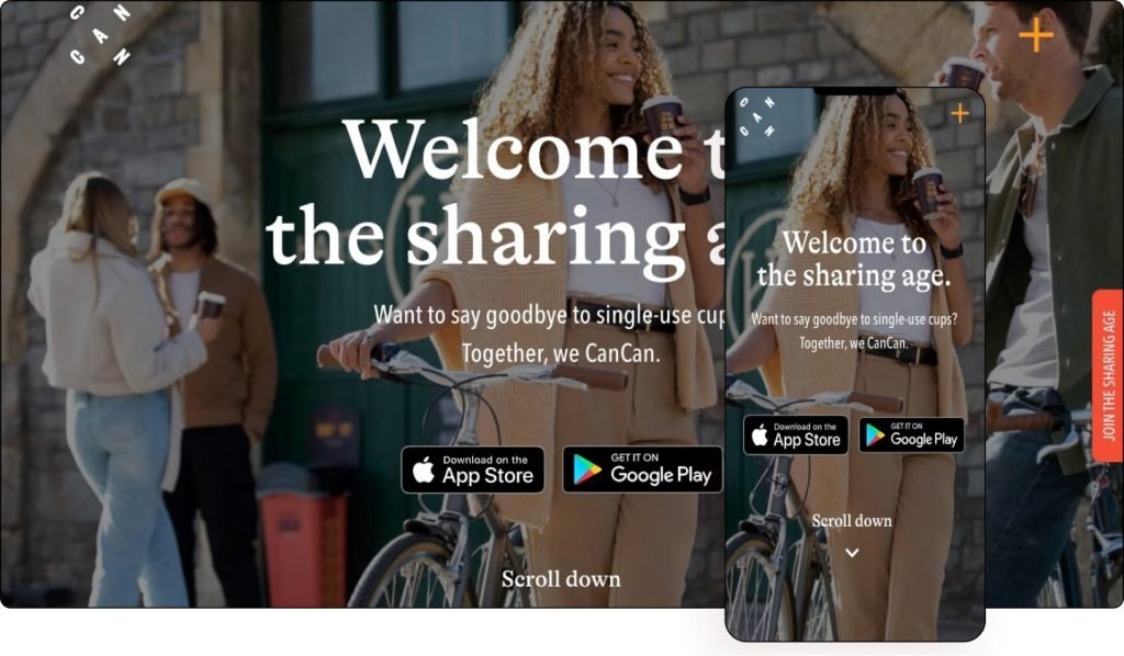
CanCan is a free, energy-saving reusable cup system designed to eliminate single-use items. Their smart app and products allow them to track the life cycle of a cup and keep a close eye on the positive impact it has on the world. They have reinvented how businesses reuse food and drink containers by sharing low-value items, helping hospitality and retail businesses reduce waste, making them more convenient and cost-effective.
The first thing that catches the eye of most people is the creative CanCan logo, followed by the site’s vibrant color scheme, giving it a fun vibe.
Visible images actually use the same colors, mixing both the combination of colors and the photograph together. Together with his illustrations, he makes the whole user experience fun and interesting.
When you hover over the orange sticker button next to the scroll bar, it changes color. Clicking on it opens the registration form. Similarly, clicking on the plus menu icon opens a series of menu items set against an asymmetrical orange background.
The UK firm’s website is a great example of cutting-edge typography, combining serif headlines with sans-serif text and clearly stating its environmental vision to attract potential customers.
Theme: Hello
Plugins: Local Google Analytics for WordPress, SG Cachepress, Yoast SEO
2kwadraat Advertising Agency
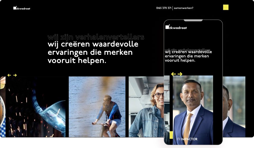
Advertising agency 2kwadraat believes that every brand has a story to be heard, seen and felt. His mission is to dig deep and fight for his clients’ right to exist. Based in the Netherlands, their goal is to engage fans of their customers’ brands by telling their stories.
The slogan of this Dutch company is: “We help brands move forward.” This also applies to the website, which symbolizes progress with colorful arrow motifs.
Using site elements such as the animated hamburger icon is a pleasure. Be sure to check out its high-contrast black-on-yellow color scheme. This means that the user must act now.
Thanks to the use of special effects on hover and mouse tracking, the menu becomes anything but static. Similarly, the animations in the images give the impression that the company is constantly evolving.
The investment in portrait photography of the company’s team members is also evident, adding an air of professionalism and sophistication through the black and white color scheme.
The stark contrast of the black and yellow color palette brings out the menus and navigation buttons in the background, evoking formality mixed with creativity. As a lead generation funnel and branding tool, a website is a good fit for both.
Theme: Hello
Plugins: WP Smushit, Jet Elements, Jet Blocks Master, Jet Tricks
TruSource Group
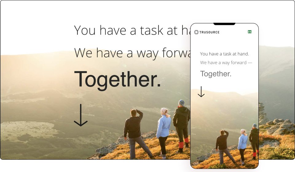
TruSource Group is an executive management consulting firm based in the California Bay Area serving organizations ranging from Fortune 100 companies to more than 100 employees. They specialize in leveraging clients’ internal resources and processes to achieve sustainable results and are trusted partners, employees and communicators at all levels of the organization.
This page contains many high definition cinematic videos embedded into one using mask form. Videos contribute a lot to the flow of a site, creating a smooth user experience.
Paragraph breaks are smoothly segmented sections in large print combined with text, interspersed with second-person marketing links that create a personal feel. By strategically leaving empty space, it allows the user to “breathe” while scrolling.
The designer’s effort is visible everywhere, from scroll effects to parallax themes and batch widgets. With a clear focus on brand presence, the Silicon Valley company’s message is beautifully expressed in thin and thin typeface that only enhances its technologically advanced vibe.
Theme: GeneratePress
Plugins: GP Premium, Preloader Plus, The Plus Addons for Elementor
WebAndMe
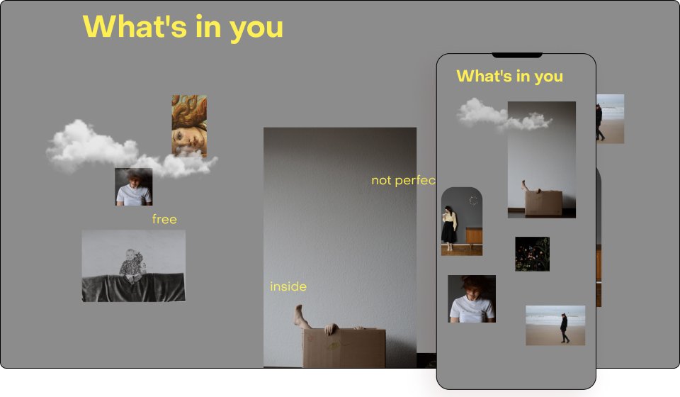
Maria Vidner believes that your site should speak for you. Your website must attract the desired customers because you deserve a website that makes you smile! He believes self-employed people can make a difference and achieve great things through their small projects. So help freelance women build brilliant websites.
If you’re looking for some out-of-the-box inspiration, be sure to add this web designer’s minimalist website for self-employed women to your list.
The site knows its audience, which it displays with compelling text that inspires enthusiasm and trust in the designer. Through her collage of photographs, illustrations, and other magazine elements, Maria shows off her creative spark on her site, sometimes with Lottie widgets, and sometimes with scroll and hover effects. She imagines herself in various scenarios, such as B. writing something or standing unnoticed in front of the camera.
The lack of a grid creates a sense of orderly chaos that appeals to entrepreneurs looking for an artistic touch of originality. Similarly, yellow text on a gray background combines sophistication and innovation that resonates with self-employed women.
Designed for lead generation, branding and blogging, Maria’s website is a great example of how to share your message while showcasing your portfolio.
Theme: Hello
Plugins: Premium Addons for Elementor
Skild Aesthetics Academy
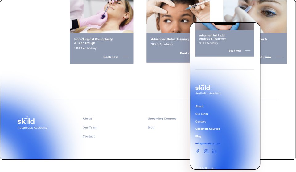
Skild is a training academy for medical professionals working in the field of aesthetic medicine. The company was created to improve the standards of teaching and clinical practice through collaboration with leading specialists in aesthetic medicine. Skild recognizes the limitations of one-day learning and has a learning academy that perfectly blends theory, practice and community for lifelong learning.
To emphasize the experience of the company, the website is made in a modern minimalist design. This puts the user experience first, providing easy navigation and course bookings.
Animated geometric shapes and Lottie widgets highlight the most important details, drawing the user’s attention as they scroll. Subtle blend modes against a large white space give the site a classy look. In fact, the use of certain geometric shapes on all pages of the site, as well as in the logo, attracts attention. The usage is also very trendy and makes this site stand out.
The website’s booking forms use the WooCommerce booking plugin, which allows a company to create a custom product model on the front-end while maintaining a familiar interface on the back-end, allowing physicians to seamlessly manage your own courses.
The use of clear characters on a white background allows the message to be read clearly. The site appears to use the same sans-serif font for both headings and small text on their websites. Indeed, the design language is very streamlined and consistent, which gives it credibility as it reflects the professionalism of the company behind the site.
The website’s clean and modern interface is designed for medical professionals who want to become experts in the field of aesthetic medicine and is designed to expand this niche professional network and training course bookings.
Theme: Astra
Plugins: Jet Engine, WooCommerce, WooCommerce Bookings
Aquadeck
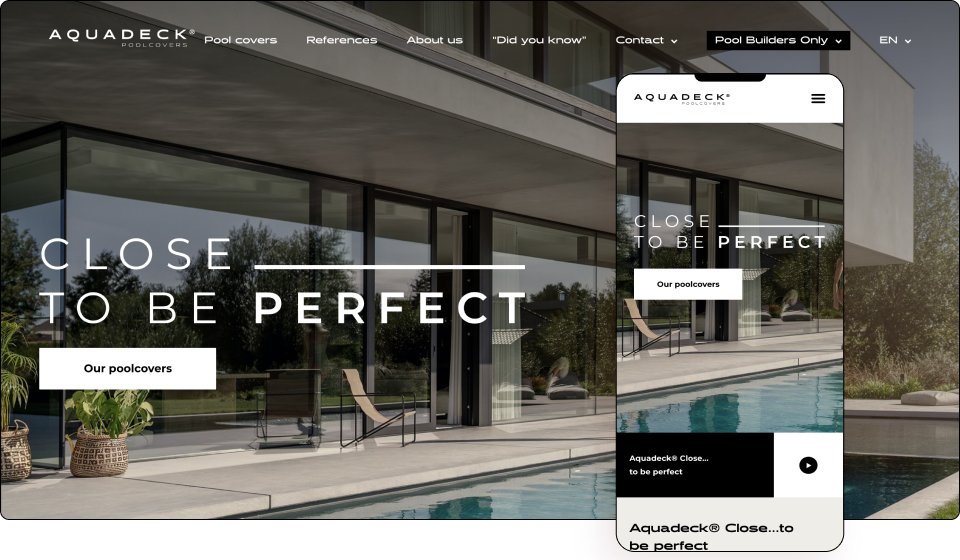
Aquadeck manufactures quality pool decking with care and craftsmanship. Drawing on extensive knowledge and years of experience, their engineers seek out the best and most attractive materials, develop the smartest designs, and use the safest components. Innovation never stops for them as they believe that products can always be better, smarter or more attractive.
Based in Budel, The Netherlands, the motto of the company is “Close… to be perfect”, which is clearly reflected in its work. In fact, given the high quality of the images presented, it is clear that considerable resources have been invested in both photography and video.
This is a good example of design that helps turn a boring, albeit niche, theme into an interesting and visually appealing site. The theme enhances the whole experience with eye-catching graphics as well as modern and contemporary layouts and fonts.
There is a clear intention that the site’s color comes from its photos, videos, and animated illustrations. The background is predominantly black and white, with soft beige accents that emphasize the quality of the product.
The site breaks with modern conventions by using sans-serif fonts throughout the site with just bold and large headings.
By visiting the “Pool Covers” section, users can drag the arrows to the left or right and see the open or closed pools in real time, partially or completely. The interactive attribute fields also provide detailed product information.
Line art of the world map can be seen on different pages such as the contact page and provide traffic so to speak. Intelligent scroll effects add movement to the calm serenity of images.
Well done and well executed site. This is another great example of how good design can impact the perception of a product and the company behind it. This is a website that really “closer to perfect” matches their product.
Theme: Hello
Plugins: Happy Elementor Addons Pro, Jet Elements, Jet Engine, WP Rocket
BAU Research
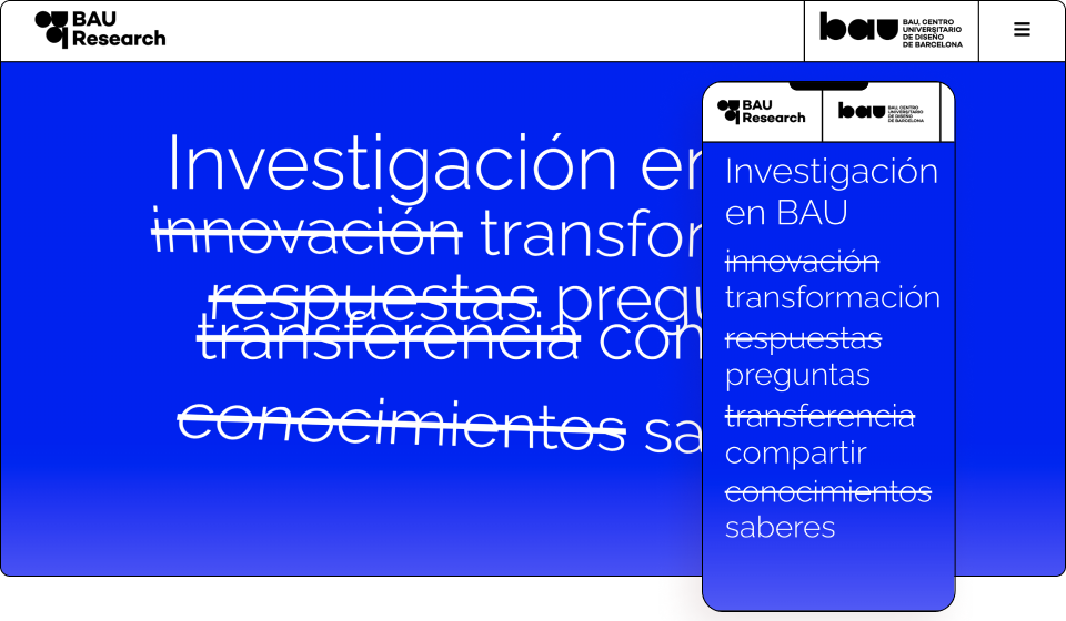
BAU is a design university based in Barcelona and affiliated with the Universitat de Vic – Universitat Central de Catalunya, which offers official design courses in the European higher education field. It was born from the belief that research is an inventive practice that can be developed creatively and carefully. They share experiences and ideas with a willingness to create new meanings, new imaginations, fairer markets and more sustainable lives.
Blue is the color of excellence, and what better way to use the color than for the heroes section of the research department. The scroll explains your unique message in thin, sans-serif text.
The hero area contains a combination of several effects: scrolling, mouse tracking and sticky widgets, as well as smart copying, especially with strikethrough text, which “eliminates” conventional thinking.
The website uses a modern minimalist layout and great typography. Use the floating menu in an unusual way: swiping down will make the menu disappear leaving the page completely blank, and swiping up will make it immediately reappear.
A number of blend modes are used to transition to its main complementary fashion message. The video background will appear shortly before returning to high resolution photography.
When you click on the hamburger menu, the entire screen turns blue so that the white text overlay is clearly visible. Again, the use of blue creates a sense of trust, peace, and loyalty.
The University of Catalonia’s research website cleverly displays email newsletter signups in its footers, making the most of the space to simply gather leads before visitors say goodbye.
Theme: Hello
Plugins: Sticky Header Effects for Elementor, ele Custom Skin Pro, WP Smushit, Complianz gdpr, WP Data Access, WP Menu Icons, Sitepress multilingual cms, Yoast SEO, W3 Total Cache
Bickford and Sons
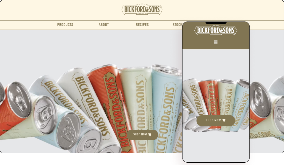
Bickford and Sons strives to create a trusting and emotional connection with its audience. They decided to earn their place as a modern classic brand by capitalizing on the history of their 140-year brand history and showcasing authenticity through an updated brand presentation in 2021. They achieve this by combining natural ingredients, a heritage of methods. artisan recipes to offer authentic and exceptional flavors created with the mood of their customers in mind.
After a redesign this year, the South Australian beverage maker has gone all out with its new website. Right from the start, we take a side-by-side look at his iconic cans in his heroes section in the form of a beautifully looped high-definition video.
The result is a calm background with colorful pockets from the brand’s iconic tin boxes that are a delight to the eye. The shape dividers neatly display the company’s products, and the minimalist design creates a very luxurious and chic atmosphere. Transparent scroll effects are well used.
The use of different background colors for the respective products and the additional combination of overlapping images give the impression that you can simply reach out and grab a drink.
The use of big bold capital letters throughout the website gives it a modern look. This is a brand that knows its young audience and directly appeals to them, visually generating interest in their product.
Theme: Astra
Plugins: Store Locator
Go to Website
Dinosauria Museum Prague
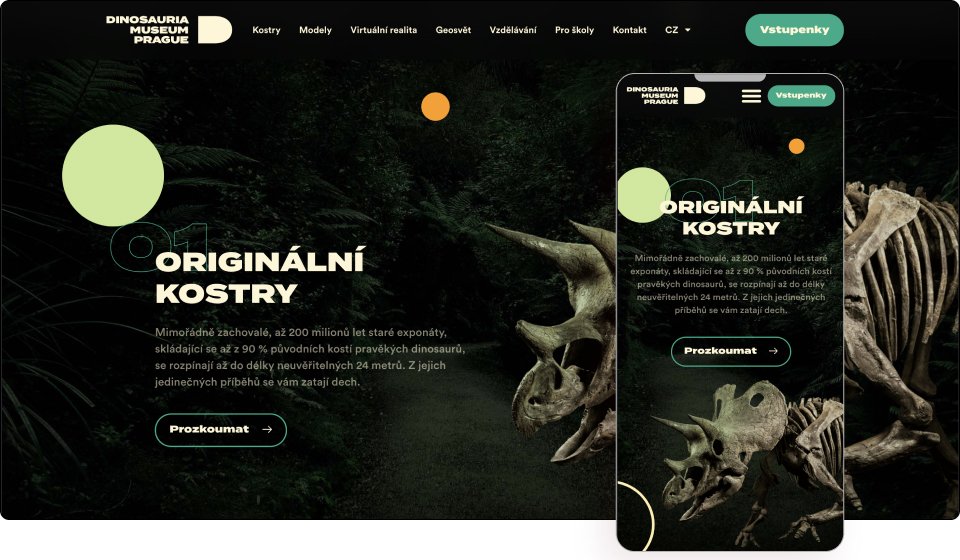
The Dinosaur Museum in Prague is a unique world that breaks the idea of a museum. They allow visitors to experience an unparalleled adventure face to face with dinosaurs in a modern interactive world. Visitors will discover the largest private collection of authentic dinosaur skeletons, models so lifelike they give you goosebumps, and the latest technology in entertainment and education.
The hero section itself is enough to inspire site visitors to become real visitors. With a variety of motion effects, custom fonts, and colorful icons, visitors are transported back in time to the age of the dinosaurs.
The site begins with an impactful video that introduces visitors to the world of dinosaurs and creates a sense of depth, as if layer by layer is being peeled off. The circles in the video are also visible on the website page, imitating something from another and time-lost spectacular world.
The use of beautiful high quality dinosaur images and the combination of scroll effects on design elements, characters and greenery creates a fully interactive experience. The sticky window also shows layer by layer the history of the museum and various activities available.
The black canvas creates a mysterious atmosphere and the neon colors stand out. In fact, various sites use dark HD videos, zoomed-in carousel images, and mask shapes, all of which combine to create a subtle mystique.
The site uses custom icons that highlight each of its key attributes. She also uses skeletal white for her text, along with green buttons and outlines, all of which pay homage to fossils of the present and creatures of the past.
Hover animations and overlay icons, as well as batch widgets, can also appear in various places on a website. There’s a lot going on actually, but it never feels overwhelming. Instead, it evokes excitement and anticipation—exactly what we want museum visitors to feel.
The Czech Republic is known for its many attractions, and now the Prague Dinosaur Museum has added another hotspot to the famous cobbled streets of Prague’s iconic map.
Theme: Hello
Plugins: HappyAddons, The SEO framework, Polylang
Digital Strawberry
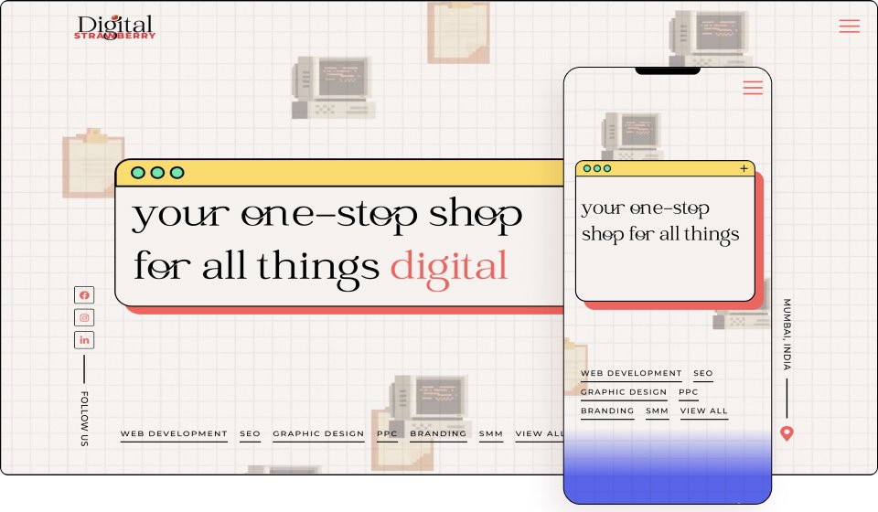
Digital Strawberry provides comprehensive digital marketing services. From designing websites that align with the client’s business vision, to graphic designing interactive creatives that connect with the client’s audience, Digital Strawberry does it all!
“PRESS START” greets visitors with retro neon pixelated text that evokes nostalgic feelings. The Graph Paper Hero Zone with old mobile desktop screens, animated animations, illustrations and bulletin boards is sure to grab your attention and take you back to the classic era of PC gaming.
The site is smart too, with a font indicator for classic headings and a modern font for body text. There are also frame components that mimic a browser or video player.
The company demonstrates its main advantages by turning a word into a static sentence. This is a good use of red text. Quite unusually, the menu is located at the bottom of the Heroes section, making it impossible to ignore.
Scrolling down we are greeted with more pixelated characters and pop culture icons from Pokémon to Hello Kitty. The millimeter paper serves as a canvas, with mixtures of blue, white, yellow and purple separating each section. This is a great example of a website that uses scroll and mouse movement effects to create a dynamic look. In addition, large fonts and colorful design motifs add liveliness and royal personality.
The site uses an easily recognizable design language, extremely creative GIFs, fun illustrations, and never-before-seen animations. Popup menus and websites are good examples of this. A soulful download from The Legend of Zelda is a good shout out for gamers, as are cat videos for internet pop culture fans. The flip phone animation on the contact page is also a nice touch.
The use of background images, overlays, custom images and fonts means that the developers have really left no stone unturned here. The site’s colors convey fun, excitement, and even optimism. This iconic website will give you that digital strawberry feeling forever!
Theme: Hello
Plugins: Jet engine, Maz loader, Rank Math
Conclusion
With plenty of unique ideas to take away, from creative text paths, to beautiful gradient, neon and pastel text, to bright black and white backgrounds, to intricate use of scrolling effects to bring messages to life, these 10 websites can inspire everyone. We hope you liked this post.
Get Elementor-Pro to build such kind of websites yourself in no time.